Objective
Redesign the Aarogya Setu Homepage.

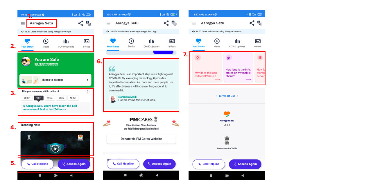
Current Homepage Look
Health Status
Nearby COVID-19 information
Self assessment test
Call Helpline
Educational Videos
Useful resources
Media
COVID Stats in India
e-Pass
FAQs
Multilingual
Share app with friends
Hamburger menu
Message from PM
Donate via PM care fund
UX Problems
Heuristic evaluation
1. Missing logo with original set of colors which impairs brand perception.
1. Missing logo with original set of colors which impairs brand perception.
2. The problem with the current navigation design is that it is at the top of the screen and
not easily reachable and thus provide not a good experience.
3. This section is USP of this app. People need to see the COVID affected, so this section
needs much more attention. Currently the statistics is shown in a vertical marquee
format with each stat coming one by one after 2-3 seconds. User has wait for seconds to
read the next stats.
4. Trending now video can be moved to media tab and to reduce the length of the
homepage.
5. Health status top section, Self Assistant and Call Again are related to each
other so they should be keep together.
6. Too many colors are used which is affecting the consistency and cohesiveness.
Solution & Revised Homepage
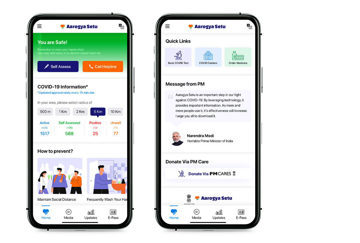
1. Added original Aarogya setu logo at the top because it is important consideration in the
brand identity.
2. Redesigned navigation menu to the bottom of the screen which is easily reachable even
in large screen phones.
3. COVID-19 Information in your area: This is the most important section currently it is
shown in vertical marquee format and have so much text.So take off the existing
format and segregate the information into numbers. Users can check Active, Assessed,
Positive & unwell all values in one click.
4. Trending now video section is moved to media tab
5. Moved the Self Assess and Call helpline buttons on the top as a part of users health
status section and to eradicate confusion with bottom navigation.
6. Redesigned the illustrations & lower section with Monochromatic color scheme to look
cohesive and consistent with entire page
Thank you